Redesigning Navigation for the High Museum of Art
A unified kiosk + mobile wayfinding system that helps 500,000+ annual visitors navigate a confusing multi-building museum faster and with confidence.
Role
Lead UX Design, User Research, Design System
Duration
Aug 2024 - May 2025
Team
1 Researcher, 2 Designers
OVERVIEW
Problem
A 25 year-old navigation issue
Visitors frequently get lost inside the museum due to confusing building structure and unclear maps, often missing exhibits or relying on staff for help.

Outcome
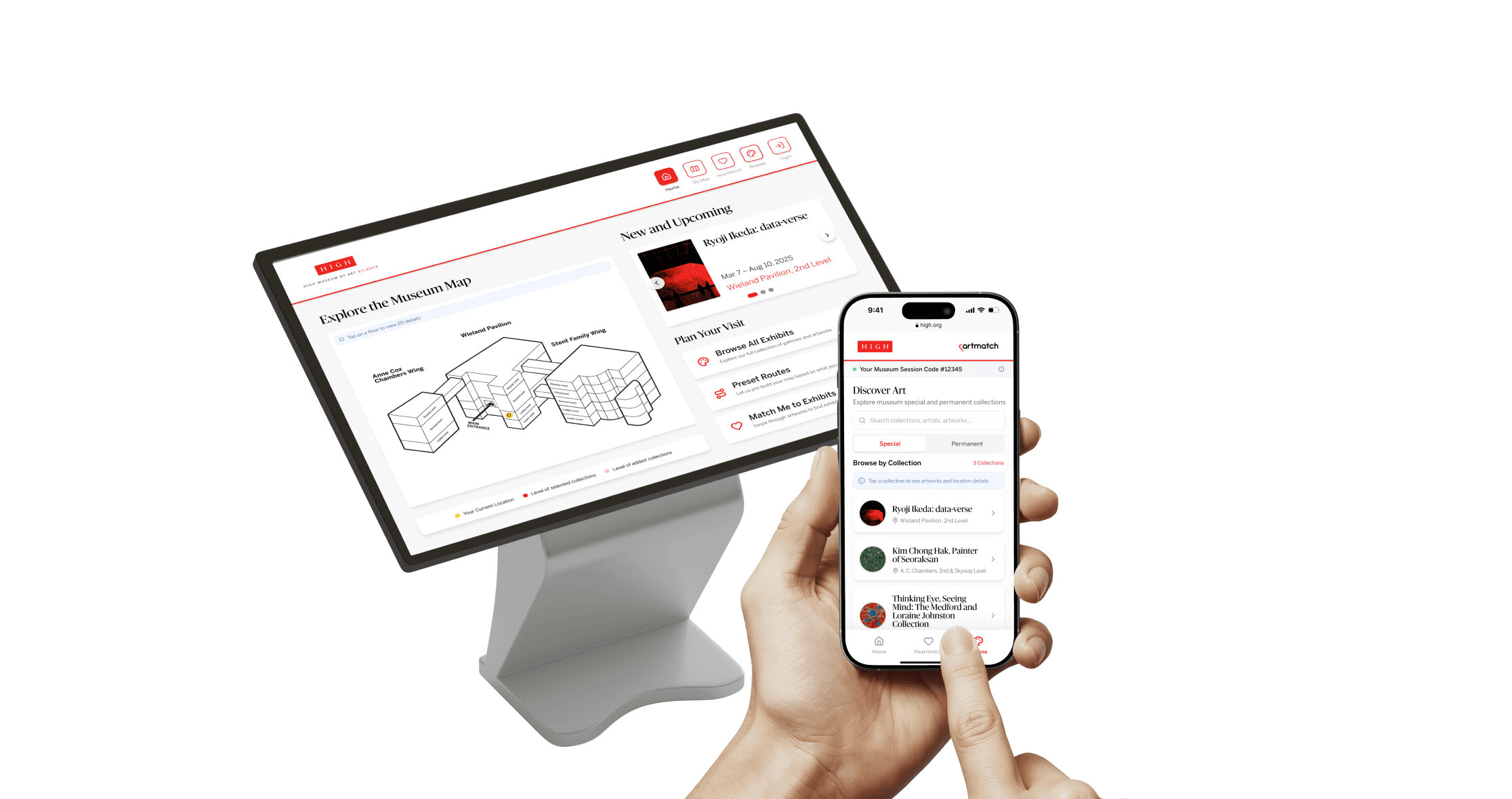
A Unified Kiosk + Mobile Exhibit Locating System
Scan a QR code to take your map and route onto your phone. A connected wayfinding system that makes museum exploration clearer, faster, and more independent.
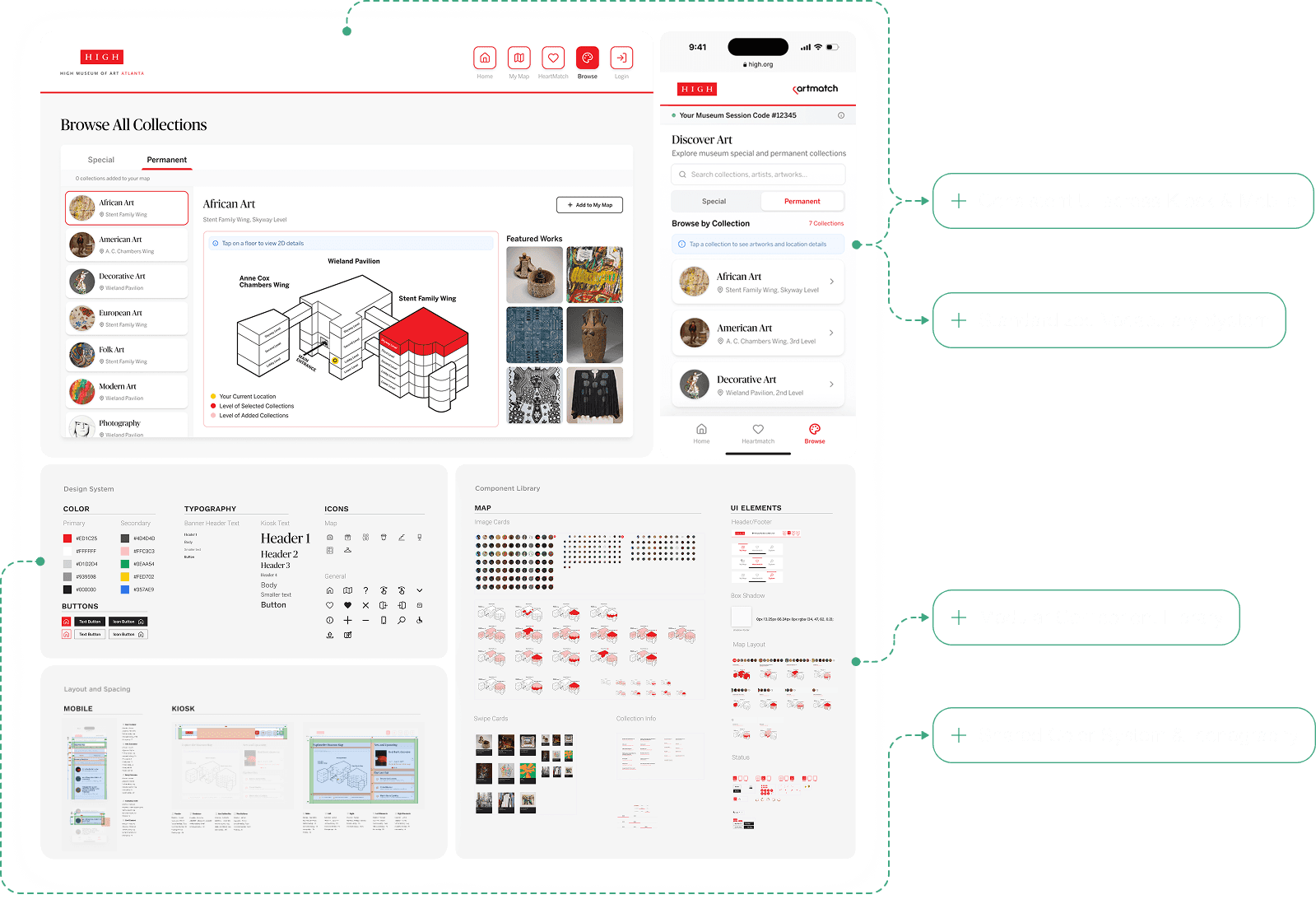
Browse All Collections. Preview. Add them to Your Map.
Browse every collection, see exactly where it lives in the museum, and curate a personalized map with one tap.
Preset Routes for Most Common Visitor Goals
Visitors can start exploring immediately with preset routes tailored for popular special exhibits or every collection in the museum.
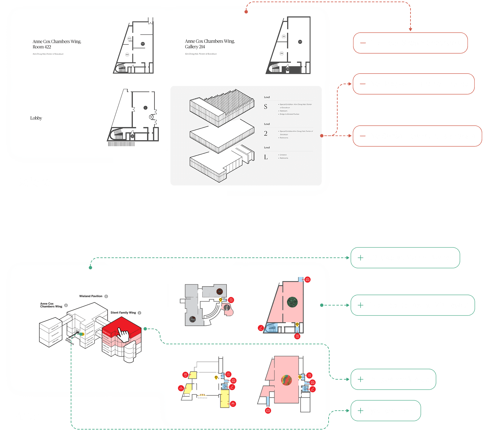
Interactive 3D + 2D Maps
Tap on a floor on the 3D map to view precise 2D floor-level detail.
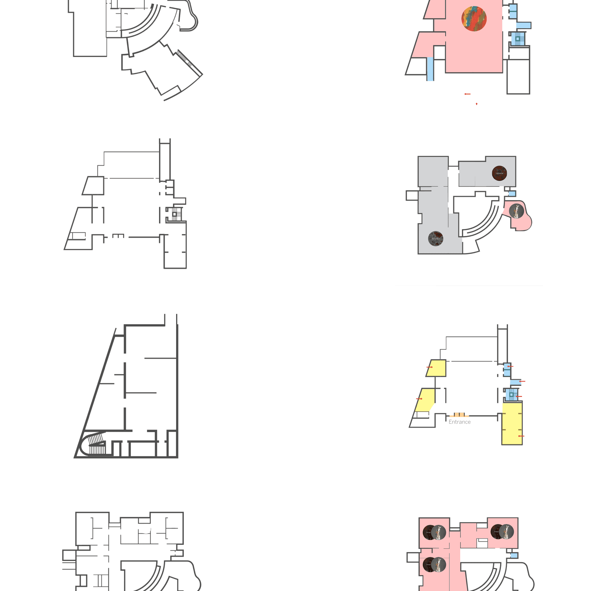
Improved 2D Floor Maps
The new 2D maps highlight exhibit zones, elevators, stairways, and orientation anchors. It reduces ambiguity and makes it easy to locate specific rooms or exhibits.
Impact
Data gathered from 3 rounds of usability testing and evaluation across kiosk & mobile tasks with 30+ participants.
Faster Task Completion
Avg task time decreased from 11 min → 8 min (25% faster).
Higher Navigation Confidence
Users reporting “confident” increased from 43% → 72%.
Independent Navigation
Participants made fewer re-starts, asking staff for help 0 times during testing.
PROBLEM
Framing the Problem Space
After preliminary research, we understood the problem more in-depth. 3 separate buildings, connected by only 3 bridges across limited floors, and inconsistent wall heights that distort spatial perception.
What makes it difficult?

And… visitors can't see these with current tools.
Problem Statement
How might we help visitors navigate to exhibits across buildings with clarity and confidence?
Goal - create a system that helps visitors:
understand the space quickly
navigate confidently
explore independently
RESEARCH
Research Methods and Insights
What does existing research say about wayfinding & engagement?
Literature Review
What we did
• 40+ papers and articles
Key takeaways
• Visitor explorer motivations are common; wayfinding shapes engagement time.
• Movement design (paths, thresholds, decision points) strongly influences exploration.
• Navigation tools vary; each has trade-offs → kiosk + map must work together.

How do other museums guide visitors?
Comparative Analysis
Sample
• 10+ comparable multi-building museums
• 10 comparison categories
Key takeaways
• Mobile apps dominate digital guidance.
• Tours and paths are often preference-based (time, interests, accessibility).
• Physical signage tends to follow collection types.

How do visitors navigate at the High?
Field Observation


Protocol
• 4 days; 3h/day
Key takeaways
• Visitors are poorly supported by physical navigation tools.
• Visitors struggle to orient on maps; “Where am I?” is unclear.
• Many ask security for directions → the current system isn’t self-serve.
How do current tools shape the experience?
Contextual Inquiry
Stakeholder Interview


Participants
• 16 CI participants (20–70 yrs) · 2 interviewees
• 11 trips · 22 hours
Key takeaways
• Inconsistent signage and map language.
• Visitors can’t locate themselves; unaware of best routes for their preferences.
• Staff frequently reiterate directions; guidance varies by familiarity.
Translating Insights to Design Requirements
• Research Findings
• Design Requirements
👁️
Visitors’ mental models of the space do not match the museum’s map.
DR1
Align mental models with unified spatial representation.
🎯
Visitors arrive with different intentions.
DR2
Support different motivations through preset or personalized routes.
🗣️
Staff often provide directions, but with little success.
DR3
Reduce reliance on staff and support effective communication.
📍
Existing tools list exhibits but not routes or “where I am.”
DR4
Provide routes and self-location cues.
🧭
Signage and terminology are inconsistent.
DR5
Establish a consistent vocabulary and visual system.
DESIGN
Design Principles
These five principles guided every design decision. They are translated from design requirements into actionable foundations for the final kiosk and mobile experiences.
DR1
Unified Spatial Understanding
A coherent spatial model that helps visitors instantly understand how buildings and floors connect.
DR2
Goal-Based Navigation
Support different visit intentions with preset routes and personalized paths.
DR3
Independent Exploration
Enable visitors to navigate confidently without relying on staff for directions.
DR4
Clear Routes & Location Awareness
Provide unambiguous paths and consistent “you-are-here” cues across buildings and floors.
DR5
Consistent Naming & Visual Language
Standardize labels, colors, and symbols to eliminate confusion across kiosk and mobile.
Big Design Desicions
Each major decision is grounded in the design requirements (DR1–DR5) derived from research and validated through testing.
• Introducing a Unified 3D → 2D Map System
DR1
DR4

Resting Screen Animation
• Designing Goal-Based Preset Routes
DR2

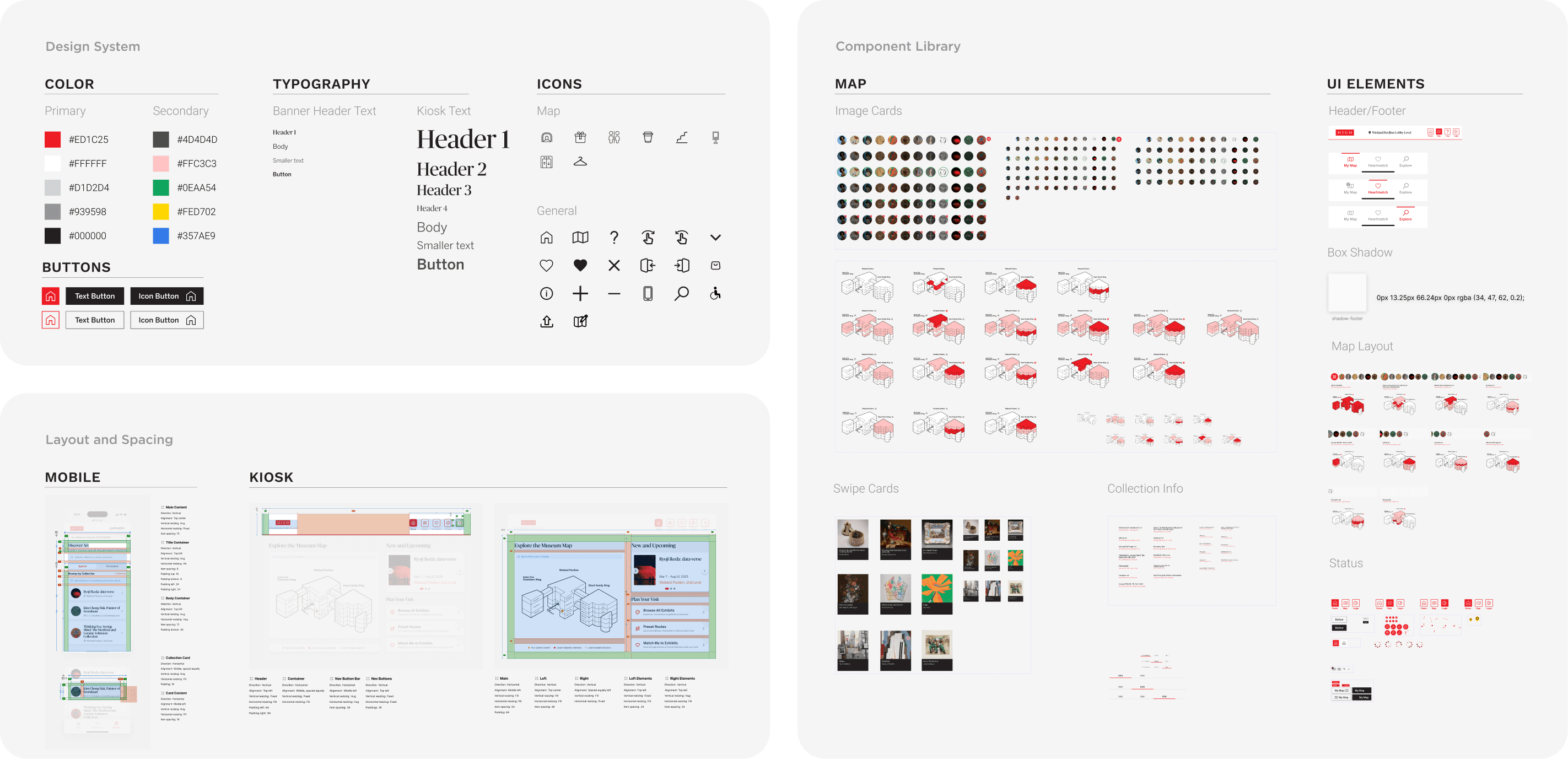
• Establishing a Consistent Visual Language Across Kiosk & Mobile
DR5
Design System
Evaluation
Testing & Evaluation Methods
To validate early navigation flows and ensure clarity
Wireframe Testing


Participants
• 10 visitors representing different demographics
Process
• Conducted wireframe testing with museum visitors using key navigation tasks (e.g., locating an exhibit, planning a route).
Outcome
• Identified early pain points such as unclear labels and the need for faster entry methods, which guided our first round of changes.
To identify usability issues through expert review
Heuristic Evaluation
Participants
• 10 experts (MS-HCI students and UX experts from industry)
Process
• Ten 45-minute sessions involved walkthroughs of kiosk/mobile flows with structured feedback and commentary
Outcome
• Led to 20+ improvement suggestions, including major ones like clarifying terminology, adding quick-start directions, and providing preset routes.

To assess visitor task performance on site
Task-Based Usability Testing


Participants
• 10 participants (a mixture of contextual inquiry participants and randomly sampled visitors).
Process
• Each 30-minute session included: participants performing navigation tasks across kiosk and mobile flows, followed by NASA-TLX and SUS questionnaires.
Outcome
• Users found the system supportive overall, though mental load was rated high.
• Led to 10+ improvement suggestions.
FINAL PROTOTYPE
REFLECTIONS
What I learned
• Balancing user needs with feasibility
One of my biggest learnings from this project was how to balance what users asked for with what was technically and visually feasible. Users often wanted more detail, more clarity, or more personalization, and I had to think critically about which changes were meaningful to implement immediately and which could be staged for later iterations. This helped me practice prioritization and taught me that design is as much about trade-offs as it is about creativity.
• Iterating based on evidence, not assumptions
Conducting wireframe testing, heuristic evaluation, and usability studies made me realize how often my first assumptions were wrong. Simple changes like adding legends, clarifying “Access Code” over “Username,” or providing quick-start tips had a much bigger impact than I anticipated. This reinforced the value of testing early and often—small usability improvements can transform the experience.
• Designing with real people in mind
What grounded this project was seeing actual museum visitors interact with the prototypes. Observing moments of hesitation or delight helped me empathize with users beyond abstract personas. It reminded me that design isn’t about perfect screens but about supporting real people in real contexts.
My Amazing Team
I'm very grateful to work with an incredible team of classmates, mentors, and industry clients. Here are the very people who made wireframes, deadlines, and all-nighters actually fun!


Powered by 4-AM vending machine coffee, overflowing Figma layers, and never too many pixel-perfect tweaks.